The Terror and Delight of Cyrillic
August 19, 2015 Russia Travel Cyrillic Robert Binghurst Buckminster Fuller
It takes a while, but you can read it.
“Typography is the craft of endowing human language with a durable visual form, and thus with an independent existence.” — Robert Bringhurst, The Elements of Typographic Style
Written language has layers. We tend to focus on the most abstract one, on meaning and message. But zoom in a little and a text explodes into individual sentences, words, and letters. They are what give the message its visual form, they perform the underlying idea on the page.
Since we know how to decipher the arbitrary symbols of our alphabet, the performance is a subtle and subconscious one. Our eyes fly across the letters, our brains assemble them into words, sentences, and ultimately ideas. This all happens so quickly that it creates the impression of operating at the shortest focal length: We are forever zoomed out, gliding across the text, rarely stopping to admire the individual letters.
What is curious about that process is that letters aren’t invisible but still disappear. They are like kernels of sand on a beach, forming an impression of the whole—the layer of meaning. This makes then a wondrous thing. And a fragile one, for it relies on our understanding of what really are just arbitrary symbols. Swap them out and it all unravels. Words not just become foreign to us, their components become indecipherable. All of the sudden, we can no longer see the beach for all the grains of sand.
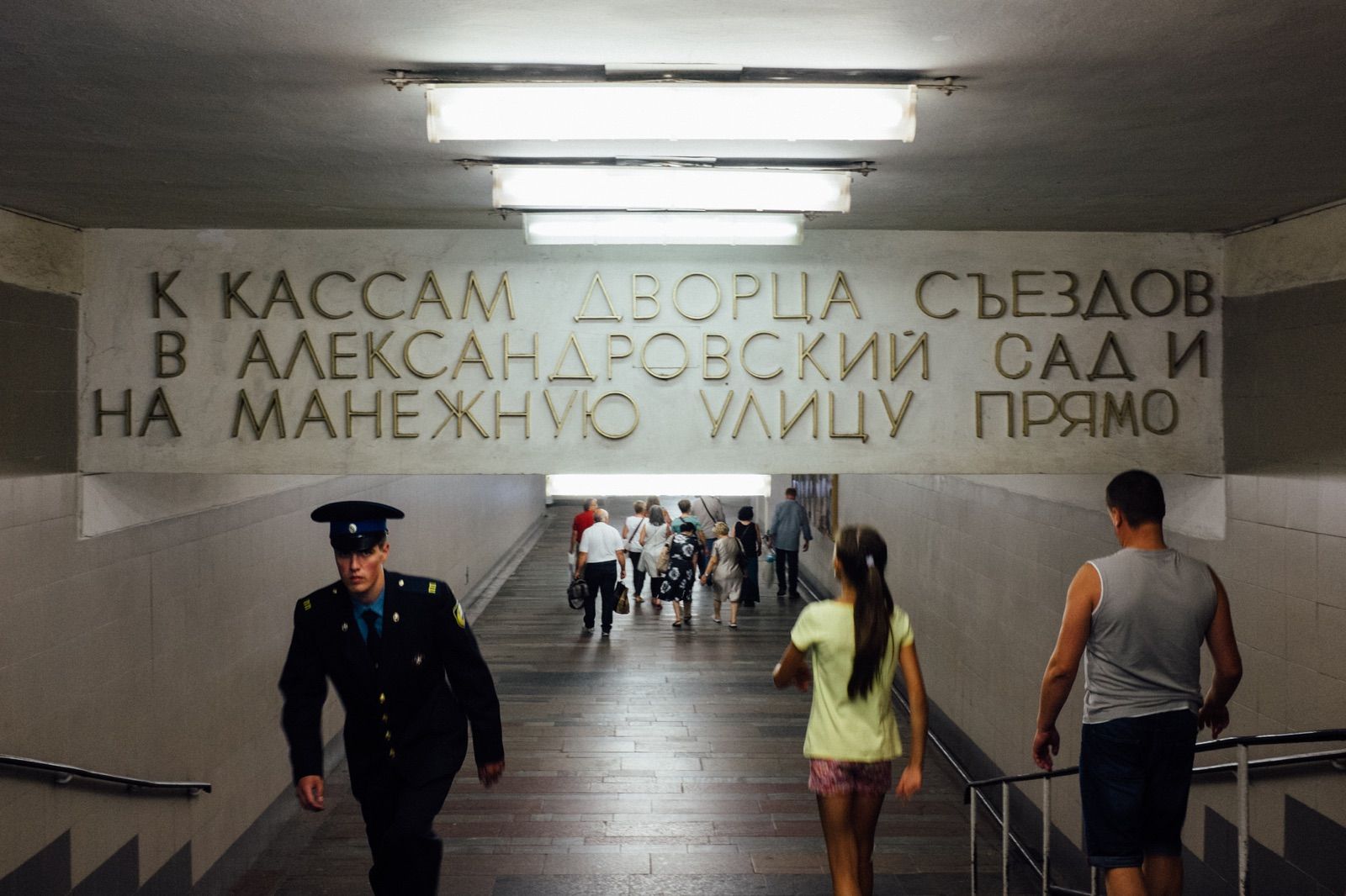
Foreign and familiar at the same time
Russia, of course, will do that to you. Step off the plane in Moscow and the signs are not just in a foreign language but in a foreign alphabet. This being an international airport, your eyes can cling to some translations, but upon leaving the terminal, less and less signs provide that kind of comfort. This is a land using the Cyrillic script, derived from Greek, invented during the heyday of the Bulgarian empire. Wikipedia tells me that 252 million people in Eurasia use it in their daily lives, countries not at all far away, and yet it seems like something from a different universe.
To the Latin-trained eye, Cyrillic looks foreign and familiar at the same time. For people who lived through the Cold War, it must be synonymous with Soviet Russia. For my generation, it entered the public imagination through vintage propaganda posters, both fascinating and terrifying. Cyrillic is like that image of Che Guevara, something so iconic that its meaning has long evaporated. It leaves you staring at the lines and curves of that script like at an iconic, abstract painting. It makes no sense. Until it does.
You read. Slowly, but you read.
Because all the sudden, something beautiful happens. You start to comprehend it. Cyrillic, you see, isn’t so hard to learn. Sure, many similarities to our own alphabet are misleading, but gradually you figure it out. Your mind starts doing its thing, mapping characters to their Latin equivalent.
Some are easier than others. Who knows what the hell Ж stands for. And don’t get me started on Ъ. But you start piecing it all together, like a child learning how to read. And then, gradually, you start zooming out. Letters become words. You say them out loud, mumble, then shout joyfully. Many words aren’t even that difficult. Names start appearing. The lines and curves become a part of the greater whole. You read. Slowly, but you read.
Regaining an ability to do something we normally take for granted is incredibly rewarding. But what is more, it makes you re-appreciate the very basics we rely on without thinking. Buckminster Fuller famously quipped that good design was “99 percent invisible”. Lines and curves that form letters and words that express ideas and meaning taking on an independent existence of their own are a genius design.