The Banality of Color
May 9, 2016 Available Light Photography Autochrome Film Photography
Why looking at the past in color is such an uncanny experience.
We tend to think of the past in black and white. Since color photography only became mainstream in the 1970s, anything from before is usually pictured in monochrome. Flip through an old photo album and you see smiling grey faces, people in grey clothes, driving grey cars. But prior to the advent of color film, inventors had long toyed with technologies to capture the world in all the colors they saw it in.
The past, slightly more accurate
As far back as in 1903, the (aptly-called) Lumière brothers in France patented a process for color pictures: It was called Autochrome and relied on glass plates containing particles of colored potato starch, which absorbed the spectrum of the light they were exposed to. It’s about as complicated as it sounds, and required such long exposures that subjects had to sit still for several minutes, literally waiting for light to filter through potatoes.
By today’s standard the technology and its results were primitive: Colors in Autochrome images are inaccurate and the motifs all fuzzy, giving the photos a dream-like quality. But it all nevertheless represented a stunning achievement: With Autochrome, colors were no longer stripped from a photo. And with that, every photographer using it captured a slightly more accurate picture of the past.
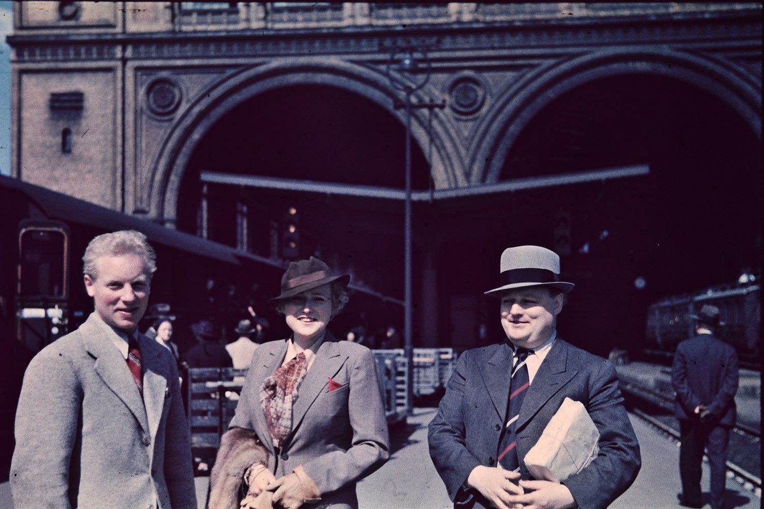
In fact, a surprising amount of the early 20th century was documented in color. Each continent had slightly different technology, so you can see colored pictures of the Russian empire’s final years, white orthodox churches standing before pale blue skies. You can see World War One, photos of the trenches full of soldiers, with their uniforms awash in color. And if you’re so inclined, you can even look into the piercing blue eyes of Adolf Hitler.
That is because Autochrome paved the way for other methods of capturing color: In 1930, the German company Agfa released their first commercial color film, which eschewed the potatoes but relied on a similar principle: For a product called Agfacolor, the engineers used cartridges of film, which they coated with a fine layer of color particles. In 1935, hot on it heels, Kodak then developed the iconic Kodachrome film, which finally nailed color reproduction. In those years leading up to the Second World War, a wholly different arms race was taking place, as Americans and Europeans each developed color films.
Exposure was suddenly quick, and film was of course much more portable than glass plates. And while it would take years for the technology to go mainstream, the times began being documented in color.
The past is strangely alive in these images. Maybe that is because black and white, by sheer ontology, gives images of the past a surreal quality: What monochrome misses in color, it makes up in contrast.
Or maybe it is much simpler: Real life simply isn’t in black and white. And seeing the past stripped off its colors makes it seem less lifelike, and by extension much further removed.
If you flip that equation around, you understand why color pictures of the past are so captivating. Not only do they show a lifelike reality, they also show that it isn’t so distant after all.
Looking at color images is strangely sobering
The National Archives of Norway—of all places—have images of Berlin from the 1930s, of the very same city where I am writing this. Back then, blue-eyed Hitler was in power, and the city was draped in Swastika flags—so many of them, it seems absurd.
But of course it isn’t. These images show the past as it actually took place. And that makes looking at them very sobering. Yes, these images show a frightening symbolism, the heyday of a terrible ideology that would plunge Europe into war. But more surprising is that they show a certain banality.
On these color pictures, the past is no longer a distant memory or a scary episode from the history books. Not even a historic outlier. The color in this pictures shows how real it all was, how much closer to our present time — and how stupefyingly normal.
Today, black and white photography has, in the words of Wikipedia, “been relegated to niche markets such as art photography”. We typically see black and white used for a certain look, employed for artistic purposes rather than accuracy. And because most photos of the past are in black and white, I think we see it as something it wasn’t: A time as unreal and dream-like as those early Autochromes.
Color adds context
Color not only adds missing information, it actually adds context. And it exposes any photo of the past for what it really represents: A document of time not all that different from our own. A world in which the events that took place—the entire unthinkable history of the 20th century—was as normal as the reality we capture with our phones today.
This article was first published as part of my podcast Available Light.