Tatlin’s Tower
April 20, 2022 St. Petersburg Russia Monument Brian Dillon Ralph Croizier Vladimir Tatlin Revolution Architecture Takehiko Nagakura Unreality
The Monument to the Third International was meant to look fake all along.
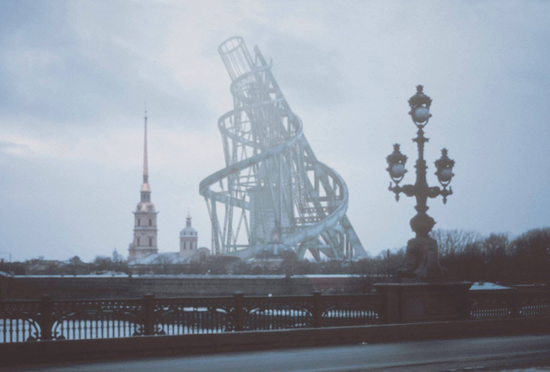
 A render of what the tower would have looked like in the St. Petersburg skyline, so fuzzy you could mistake it for something real. Taken from an animated clip by Takehiko Nagakura, who focuses on visualizing unbuilt monuments.
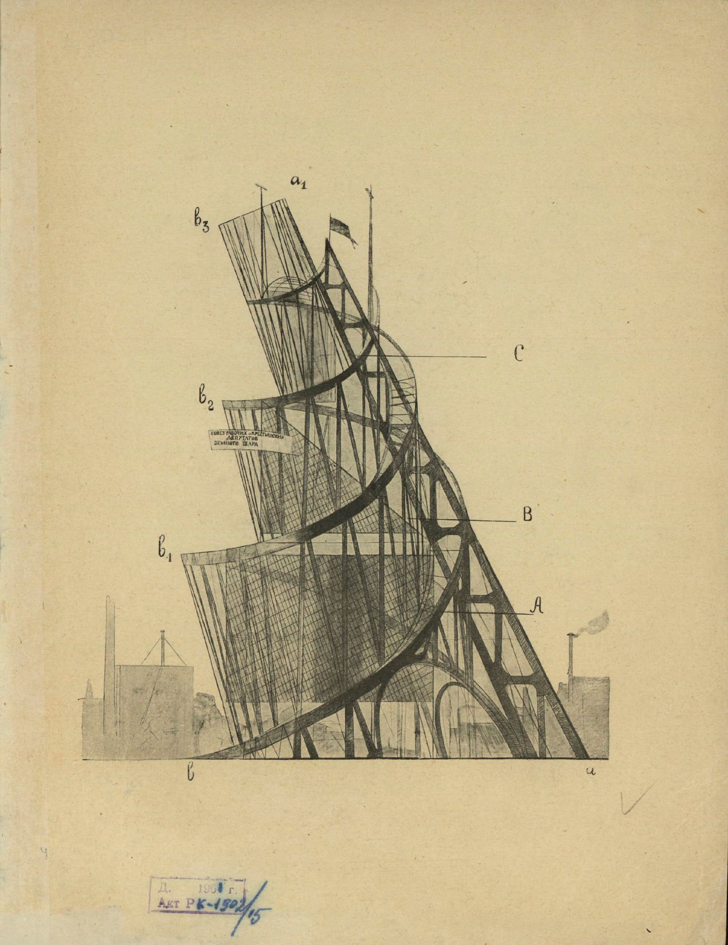
In the spirit of the off-modern, the history that almost but ultimately didn’t happen: Here’s an image of the unbuilt Tatlin’s Tower, also known as the Monument to the Third International.

Designed by Vladimir Tatlin in 1919, the tower was meant as a (propagandist) symbol of modernity and a monument to the “glory of the proletariat”. It was also a massive flex: 400m in height, the steel structure would have been 100m taller than the Eiffel Tower, with an even larger footprint:
As part of a large-scale program to replace old czarist monuments with monuments to the revolution, the huge structure was both a symbolic sculpture and functional architecture. Designed to straddle the Neva river in St Petersburg, the 1300 foot (400 meter) iron and glass Monument would surpass Paris’s Eiffel Tower in both scale and complexity. Its design consists of a contracting double helix that spirals upward, supported by a huge diagonal girder. Inside this external metal structure are four geometric volumes that were intended to revolve at different speeds.
The four “volumes” were each meant as distinct buildings, from conference rooms to a radio station, and—here’s where the idea of revolution is taken almost too literal—were meant to rotate within the structure, all at a different speed. At the time, an article summarized it as follows:
The twists and turns of the spiral are united by a network of leaning stanchions. In their transparent hollow turn three geometric bodies. Below moves a cylinder with a speed of one turn a year; the pyramid above it turns once a month and the ball at the apex completes a full turn every day. The waves of the radio station standing at the very apex continue the monument into the air.
As with many of these lofty (and ultimately doomed) ideas, it’s important to contextualize them. The tower wasn’t designed in a vacuum but within the revolutionary-modernist fervor that believed not just in the potential to reinvent the very fabric of everyday life but also worshipped technology and industrial materials as the harbingers of this new age.
The mindset was summed up pretty comprehensively in an article by Ralph Croizier from the University of Illinois, which shows that the people creating the art at that time were very much the avant-garde:
Communism would have to survive in one country and to do so it had to mobilize as much popular support and enthusiasm as possible. This is where Tatlin and other left leaning artists came in, almost all of them modernists as more conservative artists had little enthusiasm for the radical new government. (…)
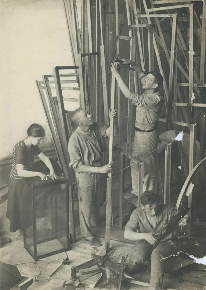
 Workers creating a model of Tatlin’s tower.
Brian Dillon wrote about the ongoing fascination with Tatlin’s tower in 2009, showing that the modernist artists stepped not only into a power vacuum but also patched over an institutional lack of creativity. The new political leaders wanted to appear progressive, but didn’t know how:
In April 1918, Lenin announced a programme of “monumental propaganda”; venerable tsarist statuary and inscriptions were to be spirited away and replaced by properly Bolshevik monuments to a revolution then only months old. It seems that Lenin had a limited sense of what such a renovated public art might look like. A photograph from that year shows him orating in front of massive half-length sculptures of Marx and Engels (…) that are utterly conventional in style.
Tatlin and the avant-garde artist of his time believed to stand (and in many ways did!) at the very threshold of a new age. They believed in revolution through art, tended to celebrate the new state. They had a deep-set fascination with new-ness, and wanted to break convention. Who could really blame them for getting carried away, to design glass and steel monuments at such mind-bending scale? Croizier: “It would not only serve as a monument to the new world order brought about by The Third International, but would also be the functioning headquarters for the new world government it would bring about.”
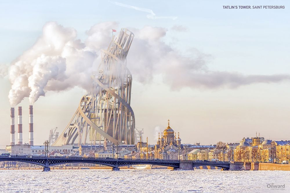
I like the following render the most, even if it looks so obviously fake: It shows the juxtaposition the revolutionaries had in mind, where something brand-new towers, quite literally over the old. Maybe it was even meant to look fake all along.
