The Triumph of the Portrait Format
November 27, 2015 Photography Screens

I received a lengthy e-mail today, which was charming not only because I love getting such messages, but also because my friend remarked that she had unintentionally written “a meter” of text. We don’t usually refer to digital pieces with the metric system, and the thought struck me as rather creative.
Ever since humanity stopped writing on papyrus scrolls, length has been measured in characters or pages, one measurement rather precise, the other rather easy to picture — like those football pitches that get invoked each time a journalist refers to large areas 1. Pages have always been tricky, though. Books range from portable pocketbooks to hefty coffee table volumes 2.
In the digital age, that measurement has become all the more useless. E-Books lay the text out dynamically, depending on the font size. And websites don’t have actual pages at all, (although we might still refer to them as such), because they aren’t vertically limited. After all, space is abundant on the Internet and scrolling means that a text can forever continue down the screen, with no pages ever needing to be flipped 3.
Computer screens used to have a bit of a problem with that, for they had been modeled after TV screens and are therefore wider than they are high. The popularity of the 16:9 aspect ratio in film actually exacerbated that issue, shaving off valuable centimeters from the top of each screen to make them wider. In theory, that shouldn’t pose much of a problem for readers, since just like in e-books, the digital text could be dynamically adjusted to flow towards the screen’s edges.
Unfortunately, it isn’t that easy: as typographers have long known, humans can only deal with so many characters per line, otherwise they struggle to find the next one when their eyes move back from the right of the text to the left (or from the left to the right, if you are reading in Hebrew of Japanese).
That is also why books had been laid out vertically and pages were higher than they were wide. This problem was put on its head (or its side, rather) when Apple introduced the iPhone. The great majority of phones (that are really small computers) which have come out since 2007 are designed to be held vertically.
In effect, we started carrying ever-scrolling, infinite pages in our pockets, which truly enabled the “meters of e-mail” and on which text rendered beautifully and legibly. All that is great news for readers but has had surprising ripple effects. People who hold their phones vertically also shoot photos with it vertically, whereas traditional cameras (and film strips) had been designed for horizontal handling.
Of course you can hold any camera as you like, but angling it for a vertical picture has always been ergonomically awkward and fidgety, with buttons becoming harder to reach or displays turning out of sight. Most DSLR camera manufacturers sell additional battery packs, which screw on to cameras and add a second shutter button to use for vertical pictures.
Phone pictures, in contrast, are predominantly taken in portrait format. Sure, you can turn your phone on the side and take a landscape picture, but not only does it pose similar problems with ergonomics, it is also an additional steps: If you are already holding your phone a certain way, you are bound to just open the camera app, point and shoot — with the resulting picture being vertical.
Ironically, horizontal shots also pose the problem of looking terribly small on vertical screens — they are letterboxed with ugly black bars and require zooming and panning to be viewed in full-resolution glory. On the popular photo-sharing platform Flickr, which keeps statistics on all uploaded photos, mobile phones have long surpassed DSLRs as the most popular type of camera. I couldn’t find a statistic about image orientation, but I think it is safe to assume that this has resulted in a late victory: The triumph of the portrait format, if you will, with many more images of that orientation being uploaded than ever before.
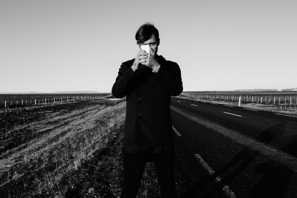
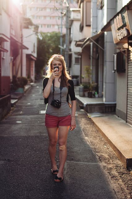
The combination of digital photography and vertical forms has even led to new types of motifs, such as selfies, which fit perfectly to the new screen alignment. Our faces are vertically angled, and the screens feel like a natural extension to the portrait format. Tilting the phone sideways only makes sense if you have to accommodate more than one person.
We’re stuck looking at a vertical world through horizontal screens
And then there’s the task of looking at pictures, one of the things touchscreen devices excel at. Here, the portrait format really shines. It gets even more interesting when we look at video. Both photos and videos had been around in the analogue world, but were handled very differently.
Photos were commonly printed (unless you showed them as slides), which allowed for easy turning of the appropriate images in a stack of pictures.
Film, however, always required a projector and was fundamentally inflexible — no wonder all video was shot in landscape and resulted in the aforementioned screen orientations of TVs and — by extension — computer monitors. On phones, of course, people shoot video just like they shoot pictures: Vertically. And while that feels natural when you hold your phone vertically, a vertical video looks really bad when the phone is held sideways: On the 16:9 screen, the black bars on each side take up more space than the video itself. What is worse is that mobile videos don’t translate very well to the traditional domain of moving images: Horizontal screens on TVs or desktop computers.

Horizontal screens aren’t made for vertical images — and vice versa. It seems, then, that we simply cannot win: Videos produced for TV screens get letterboxed on mobile screens, which would require you to turn your phone, and which many people don’t bother to do it 4.
To tackle that problem and achieve higher engagement rates, video producers like the popular German tabloid Bild recently went all in on mobile and switched to producing their videos exclusively in portrait format.
We are, effectively, stuck with a horizontal world of desktop screens and a vertical world of mobile computing. Instagram had graciously solved this problem by insisting on the square format, until relenting earlier this year when they allowed you to upload photos and videos in any format you desire.
But being a mobile platform that is primarily viewed on mobile screens (they have a web version, but I doubt it gets much traffic compared to mobile), the old problem immediately surface again, and horizontal photos look terribly small in comparison to vertical or square ones.
It’s easier to picture three hundred pitches of burned rainforest than one hundred thousand burned trees.↩︎
That is presumably the reason why Amazon has begun showing the size of each book in relation to a human, a little illustration of a grey figure cradling your desired book in its arms like a newborn↩︎
This, by the way, is what upsets me the most about web pages that break their content down into different “pages” to generate page impressions. It re-introduces a former limitation in order to fulfill the requirements of a fundamentally illogic metric. Don’t get me started.↩︎
My girlfriend, for instance, keeps her phone permanently on orientation-lock, as she finds the sudden turns of the display visually disruptive↩︎